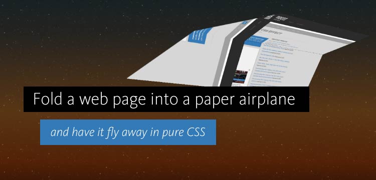
Impressive effects can be created with pure CSS without resorting to JavaScript 3D libraries or HTML 5 canvas drawing. Imagine the web page you are looking at folding itself up and flying away like an airplane. That’s exactly what we’re going to do. Click the button above to see the effect if you haven’t already. […]


 by
byThis article was posted by Independent Software, a website and database application development company based in Maputo, Mozambique. Our website offers regular write-ups on technical and design issues, ranging from details at code level to 3D Studio Max rendering. Read more about Independent Software's philosophy, or get in touch with Independent Software.
Impressive effects can be created with pure CSS without resorting to JavaScript 3D libraries or HTML 5 canvas drawing. Imagine the web page you are looking at folding itself up and flying away like an airplane. That’s exactly what we’re going to do.
Click the button above to see the effect if you haven’t already. How cool is that? In the rest of this post, we’ll explain how this effect is achieved in CSS only, without resorting to any JavaScript library (although a few lines of JavaScript are used to start the effect, but that is all.)
The ingredients for this effect are CSS 3D transforms, CSS/SVG clipping and animated gradients.
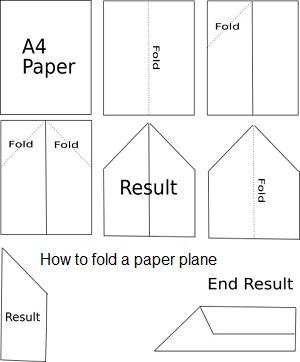
How to fold a paper airplane
There are many ways to fold a paper airplane from a sheet of paper, but to keep the CSS transformations we’re going to need simple, we’ll take the simplest approach. Here’s an image off the web that shows how to fold a very simple airplane:
For our effect, we’ll need to take a rectangular <div> and cut it up into smaller <div> elements, each of which will be transformed using CSS @keyframe animations. We’ll work from with a square parent <div> to make diagonal folds easier. First, here is a schema that shows all the required <div> elements, with the nose of the airplane facing left:
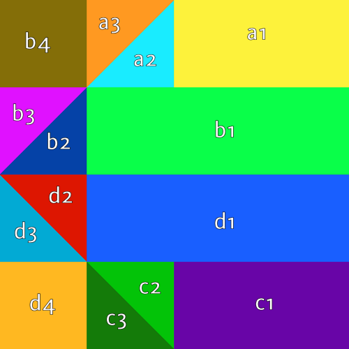
The folding takes place in three steps:
- The triangle formed by a3, b4 and b3 is folded to the bottom right, while the triangle formed by c3, d4 and d3 is folded to the top right;
- the entire top and bottom quarters of the diagram are folded inwards (i.e. a1+a2+a3+b4 and c1+c2+c3+d4);
- the diagram is folded across its center X-axis.
The first step, then, is to define a set of <div> elements, all positioned within the parent <div> at the correct positions. Percentages are used for positioning so that the parent <div> can be of any size. For instance, a3 would be defined like this:
The structure is not entirely flat, though. Elements a1, a2 and a3 are actually all contained in a separate container so that they can be folded all at the same time. The same goes for c1, c2 and c3.
Projecting an image onto the airplane
The <div> elements we have so far are blank. In order to get an image on to them, we’ll have to set a background image for every single element and scale and translate it in such a way that is shows the correct piece of the image. For testing, we used the colored diagram above which would later be replaced by an actual web page. For element a3, the projection is:
Since a3 is 4 times smaller than the root div , the background image must be 4x increased in width/height. Also, the resulting image must be shifted to the left.
In this demo, we will use a screenshot capture of a web page. It is possible to use an actual live web page, but we decided against it for performance reasons. There are two ways to go about this:
- <iframe> elements can be used instead of a background image. With their borders removed, and all overflow set to hidden, these iframes will work just like background images (you can use scaling and shifting to position their contents just like above). The caveat is that you can’t load an iframe containing the page you’re currently on, so a copy will have to be created beforehand, and since you’ll be creating as many as 14 iframes, it’s rather heavy on the browser. The upside is that the browser does all the rendering and the page copy will be exact.
- The contents of the parent page can be copied into the <div> elements using some JavaScript’s cloneNode . This works, again, in a similar way: you can zoom and shift the copied contents using CSS transforms. Unfortunately, this is also quite heavy for the browser, since you’ll be creating very many elements in the DOM.
Since the effect will be used on a single page only, using an image for the plane content is enough. In order to keep the background image up to date as the page contents change, services like the Screen Shot Machine or SnapItTo could be used, both of which keep a copy of the page render in their cache for a set number of days (configurable), after which they update the render. It will be necessary, though, to create multiple screenshots: a full page shot for desktop visualization, and a narrower one for mobile devices (Independent Software’s website uses a responsive design that changes as the screen gets narrower). CSS @media queries are then used to pick the correct image:
It is important that the screenshot image is preloaded before the effect starts, or the airplane will be invisible while the image is still loading.
Folding the elements
When the effect starts, the individual <div> elements and groups of <div> elements are folded using CSS transforms. For folding the side of the airplane this is simple, since the fold occurs over the X-axis. The animation looks something like this, where sideA is the container that contains a1, a2 and a3:
Things are not so simple for the elements that must be folded diagonally. rotateX and rotateY can no longer be used, but instead we must use translate3d to define a diagonal axis of rotation:
The axis (-1, 1, 0) defines an axis from the bottom right to the top left in the XY plane. There are two other things of note here:
- The rotation is 179 degrees, not 180. This is done so that a3 will not occupy the same space as a2 at the end of the animation. On Firefox, this would cause problems with the Z-order which results in flicker.
- As the element is rotated, it is also translated outward along the Z-axis by 2 pixels. This very small separation from a2 also helps reduce flicker on Firefox. Chrome does not have any of these issues.
Planes b4 and d4 are special cases that get rotated around their bottom right and top right corners, respectively. This is done by shifting the transformation origin to these points:
Clipping triangles using CSS and SVG
Some of the <div> elements are triangular and must be clipped. This presents a problem, because clipping support is poor across browsers. Webkit browers like Chrome can use the clip-path CSS property with a polygon in it, but this approach is not supported by Firefox at all:
Firefox must use SVG clipping, where a clipping path is defined in a hidden SVG image and used through CSS. Also, this approach in Firefox only works as long as the CSS properties that use the clipping paths are placed in inline CSS – it took awhile to figure that out.
To clip a square <div> to keep only the top-left triangular half, SVG clipping works in both Webkit and Firefox:
Similar SVG clip paths can be defined for top-right, bottom-left and bottom-right triangles. The clipping path defined in the SVG only needs to be defined once and can be used many times. The polygon that defines the path uses a unit coordinate system, that is (0,0) to (1,1), and since the clipPathUnits attribute is set to objectBoundingBox the resulting clipping path is automatically stretched to fit the target element. In other words, the same clipping path can be used to clip elements of any size.
The SVG image is only used to define the clipping paths. Its width and height attributes are set to zero so that the image does not appear to the user.
Conclusion
That’s it! Take a dive into the source code of this page if you want to see full CSS definition.
This effect was tested on Firefox, Chrome and Android browsers. Did it work for you? Leave a comment and let us know!
Wow! That’s so cool!!
Not working for me (Internet Explorer)